Blog Archives
How to Grow Japanese Maple
Significant progress has been made on the red tree painting. And by significant I mean, it’s now done. I’ve named it ‘Japanese Maple’. It seemed fitting as this would be the type of tree that inspired this piece. I went to a japanese garden in Fall once, and the red of these trees is something out of this world. So vibrant! It’s such an impossible color to be seeing on a tree in nature that you’re almost tempted to believe they were actually painted this red.
But before the big reveal, let me show some of the steps that were left to make it into the final piece it’s become.
We left off last time with only the background completed. After waiting for the paint to dry, as previously discussed, the canvas was ready for the next step. This would be painting the trunk, roots and branches of the tree.

I quickly freehand the general shape and placement of all the branches and roots. I have the tiny doodle from my notebook to base these on. This step is only meant to be a guide. Then I start filling out everything and actually painting the true shapes. I particularly enjoy the not quite symmetry of the roots on this design. Your brain sees symmetry but there really isn’t that much. What a lovely trick.

Eventually the tree is all painted on. At this point I look at it and think ‘this could be a finished piece as it is now…mmmm’… but then that is not the plan. I will, however, file the idea away for a future painting. I think I might design the branches differently if they are to be bare…and maybe give it a winter feel… So it turns out it’s just as well I’ve decided against it for now.

Then comes the leaves. I love red! Stunning with just black and white as companion colors. Red, unfortunately, is a capricious color. It always requires multiple coats because of its transparent base. You can see that here. the background is still showing through. So this will end up taking at least 2 coasts, 3 in most areas, especially where the red leaves will overlap the black branches. The effect I want here is a flat, red, color block of leaves, completely opaque. No shadows, no highlights. Almost as if this was cut out of colored paper. Same as the black tree.
Perhaps I should’ve mentioned first that this is not a complaint. As I said, I love red, and it is well worth spending the extra time with it to get it exactly right.
And then all that is left to show now is the final product.
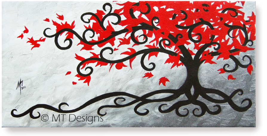
Tadaaaa!!
I am very pleased with the end result.
It was a simple and relatively quick painting. A good addition to the collection. I may do more in its style in the future. Working on it has given me ideas…many ideas…
-MT
Simple Start
I have a pile of sketches and rough draft always waiting to come to life as full pieces. Lately I’ve been trying to work on a few collections of paintings. I like having an assortment of the same themes or styles. Once you have an idea, more always follow so why not make them too yes? There’s a few extra reasons why this is a good idea as well.
So having been ultra busy lately on setting up the website and doing custom work for various entities, this little painting will in fact be the very first started in 2013.

Here is the tiny doodle from my notebook that it will be based on. This guy doesn’t even get to have a full proper sketch. Poor thing.

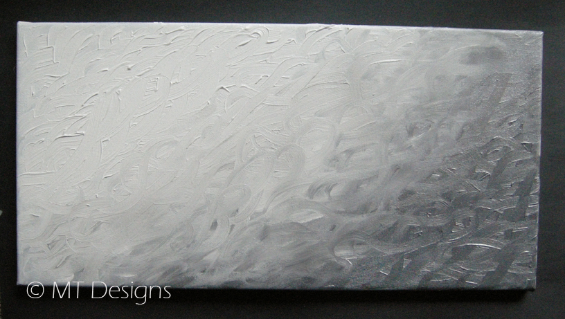
I started by applying a base color coat to the canvas. We don’t need to share that boring step in images. This piece will be a 12″x24″ so nothing outrageous. He is meant to be added to a collection started by these pieces here from a few years ago.

I’m using some silver paint which I’ll be mixing gradually with black and then white. I want this piece to have a tiny bit of texture so I’ll be mixing the colors right on the canvas. Fun stuff.
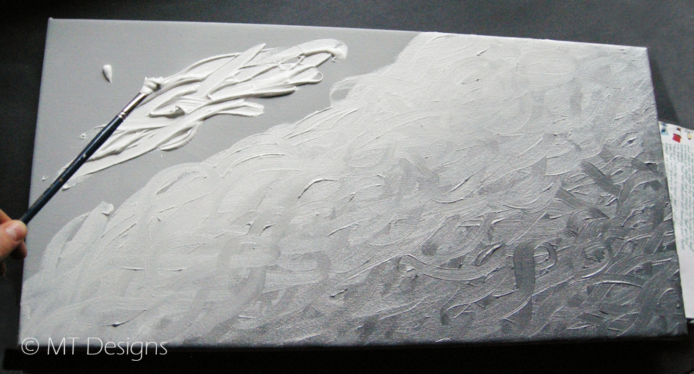
It’s a visually simple design so it’s good to create some detail in the background to give it interest. Foreground items are pretty much just opaque blocks (that’s simplifying it a bit obviously but you’ll see what I mean)
Take my word for it people, nothing is harder to create than simplicity. When done well, it seems so obvious it must’ve taken no time or thought process at all. Far from it. Some of the most challenging projects I’ve had to work on ended up being some of the plainest looking end products… and they looked stunning for it! But to get there… well that’s a story for another day.
Anyways now it’s gotta dry… my least favorite part is the wait… can’t…stand…it. This is when I go start another project. We’ll get back to this one soon…
-MT


